Holiday Gift Guide: 15 Retro Gaming Gifts Under $50
Fifteen retro gaming gifts that stay under fifty dollars, from cleaning kits and cartridge stands to...

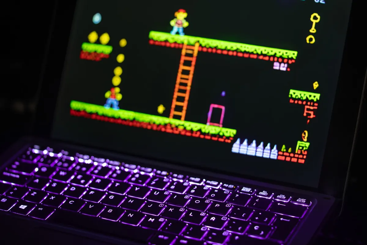
A 16-pixel-tall knight has room for a helmet, a visor, and maybe a plume. Not a face. That single constraint explains more about the look of modern indie games than nostalgia does. When you shrink a character down to a handful of blocks, every decision becomes visible: how many colors you use, how far an arm swings, whether a shadow is one pixel or two. The 8-bit look isn't a filter you apply at the end of production. It's a set of limits that shape the whole process, from the first sketch to the last animation frame.
Classic hardware gives you the numbers that most developers still work from. The NES drew 256x240 pixels. The Game Boy managed 160x144. The Commodore 64 offered 320x200 with 16 colors. Those figures sound unusably small until you see them blown up on a modern display, where they read as bold and legible rather than cramped.
The practical question is what happens when you scale. A 16x16 sprite displayed at 4x becomes 64x64 on screen, which is comfortable on a 1080p monitor. But that also means the smallest detail you can draw is a 4x4 block. If you pick a base resolution that's too high — 640x360, say — you need far more pixels per character to fill the frame, and the chunky charm thins out into something that looks like a slightly blurry photograph of pixel art.
Most modern indie teams land on a base of 256x144 or 320x180 for widescreen, or 256x224 and 320x240 if they want a 4:3 frame that suits a CRT-style border. Pick one, write it down, and never break it. Then scale by whole numbers only: 2x, 3x, 4x. Fractional scaling is what produces that shimmering, uneven look on so many otherwise handsome games.
Old systems forced cruel choices. The NES could choose from roughly fifty colors overall, but any single sprite had three plus transparency. The Game Boy had four shades total. The Commodore 64 gave you sixteen colors for the whole screen.
Those limits teach a lesson that holds up today. You can't sculpt form with soft gradients, so you learn to do it with value contrast — a dark outline, a mid tone, a light tone, one accent. A well-chosen three-color character usually reads better at 16 pixels tall than a 24-color one, because the eye can parse the silhouette instantly.
Build yourself a fixed palette of twelve to sixteen colors and assign each one a job: shadow, mid, highlight, accent, UI. Reuse it across characters, tiles and effects so the whole game feels like it belongs to one world. Palette swapping is the cheapest content multiplier in the medium — a red version of the same sprite is a boss variant, an ice enemy, or a damage flash.
Dithering is the other classic trick: alternating pixels of two colors to suggest a third. It works beautifully at low resolution and looks like noise at high resolution. If you're not actually drawing at a small pixel grid, skip it.
8-bit consoles built backgrounds from 8x8 tiles, stitched together from a small library of unique pieces. Sprites had their own caps — the NES could only show eight sprites on a single horizontal line, which is exactly why characters in old games flicker when things get crowded.
You don't have those hardware limits anymore. You should probably keep some of them anyway. A consistent internal budget is what makes a game look deliberate rather than merely small.
Walk cycles in this style typically run two to four frames, played at roughly eight to twelve frames per second. That's not a compromise; it's a rhythm. Idle animations often consist of a single one-pixel bounce, or a two-pixel breath. A jump reads better with anticipation — one crouch frame held slightly too long — than with any amount of extra detail.
Palette cycling handles water, lava, torches and energy fields. Instead of redrawing an animation, you shift colors through a fixed loop on the same tile. Screen shake moves in whole pixels; a half-pixel shake just looks like a rendering bug. Flipping a sprite horizontally doubles your animation count for free, which is why so many characters are drawn in near-profile.
Draw the silhouette first. If the pose doesn't read in solid black, more colors won't save it.
One trap is sub-pixel movement. If you slide a character by half a pixel per frame, the sprite has to be redrawn off the grid and immediately loses its crisp edges. Either snap everything to whole pixels, or render the entire game at a low internal resolution and scale the finished frame up. The second option is what most engines do well.
Not everything with visible squares is doing 8-bit design. You can usually spot the difference in seconds.
Real pixel-art games keep one consistent pixel size. Fake ones mix them: a character with one-pixel details standing next to a tree with four-pixel details, sprites that rotate smoothly, text rendered at a different resolution from the art, shadows that blur. A pixelation shader over high-resolution assets produces mush, because it's averaging detail that was never designed to be averaged.
The fix is unglamorous. Choose your grid, export every asset against it, disable filtering, rotate by drawing new frames instead of transforming, and keep your UI on the same pixel scale as the world. That last one trips up more projects than any other.
Constraints are only useful if you commit to them early. Before you make a single asset, write down your spec and tape it above your desk.
Then test rather than guess. Export a screenshot at your final output scale and look at it on an actual monitor, not zoomed in at 800% inside your drawing tool. If the scene reads at 1080p, your choices are working. If a character disappears against the background, you have a value problem, not a color problem.
Tools matter less than the rules. Aseprite, Piskel and LibreSprite cover drawing; Tiled handles maps; Godot's pixel snap and Unity's pixel-perfect camera handle the scaling math so you don't have to. Whichever you pick, the discipline is the same: small grid, small palette, honest frames, whole-number scaling.
That's the thing about the 8-bit look. It isn't one aesthetic, it's a set of bills you agree to pay. Pay them consistently and a game made by two people in a bedroom can look as coherent and confident as anything with a budget ten times its size.
Fifteen retro gaming gifts that stay under fifty dollars, from cleaning kits and cartridge stands to...
A practical playbook for starting a monthly retro gaming meetup: finding a venue, picking a format,...
Nine mistakes new retro collectors repeat, from overpaying for loose discs to storing boxes in damp...